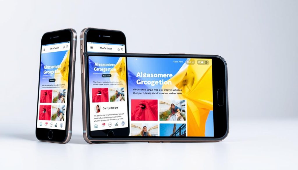
Mobile responsiveness is key to making my site better for everyone. Over 50% of web traffic now comes from mobile devices. It’s vital to make sure my website works well on phones and tablets.
Mobile-friendly design means my site looks great on any screen size. This makes it easier for users to navigate and enjoy my content. By focusing on mobile responsiveness, I can make my site more accessible and user-friendly.
Studies show that good responsive design keeps users from leaving and helps keep them coming back. It also helps my site rank better in search results. This is because search engines like websites that work the same on all devices.
By making my site responsive, I can make more people want to buy or engage with my content. In fact, it could boost my conversion rate by up to 27%.
Key Takeaways
- Mobile responsiveness is crucial for improving a site’s accessibility and usability.
- Over 50% of all web traffic comes from mobile devices, highlighting the need for mobile-friendly design.
- Responsive web development can improve SEO rankings and increase organic web traffic.
- A well-executed responsive web design can prevent user abandonment and bolster user retention.
- Implementing responsive web design principles can increase the conversion rate by up to 27%.
- Mobile responsiveness is essential for providing an optimal user experience across all devices.
Understanding Mobile Responsiveness
Exploring mobile responsiveness, I see how vital it is for a great user experience. Most people visit websites on their phones. So, making sure my site works well on all devices is key. Adaptive design helps me make my site easy to use for everyone.
Mobile optimization is also important. It means making my site fast and easy to use on phones. This way, users don’t get frustrated with slow loading or hard-to-use sites. Studies show mobile-friendly sites keep users longer and engaged.
Some great things about mobile responsiveness include:
- Improved user experience and engagement
- Increased website traffic and conversions
- Enhanced search engine rankings, as Google favors mobile-friendly websites
- Better interaction with visitors on mobile devices, leading to increased loyalty and return visits
By focusing on mobile responsiveness, I can make my site better for all devices. This leads to more visitors, sales, and growth for my business.
Assessing My Current Website’s Mobile Responsiveness
It’s important to check if my website works well on mobile devices. This means checking if it looks good and works right on different phones and tablets. A website that adapts to different screens is key to a good user experience.
There are many tools to test how well a website works on mobile. Chrome DevTools and Firefox Responsive Design Mode are great for this. They help me see if everything fits on the screen and loads fast. I can also use Browserstack, Ghostlab, and LambdaTest to test on many devices and browsers.
Some important things to check include:
- Verifying content fit on screens
- Checking loading times
- Ensuring navigation is user-friendly
By checking how my website works on mobile and making changes, I can make it better for users. This can lead to more people using and enjoying my website.
Recent stats show that over 58% of people use mobile devices to browse. Making sure my website is mobile-friendly is crucial. It helps me reach more people and stay competitive.
| Device | Browser | Operating System |
|---|---|---|
| iPhone 8 | Safari | iOS 12+ |
| Galaxy S9 | Chrome | Android 9+ |
| iPad Pro 9.7 | Safari | iOS 12+ |
Designing for Mobile: Best Practices
When designing for mobile, the user’s experience should come first. A mobile-first approach makes websites better for smaller screens. This makes it easier for users to find what they need.
Responsive web development is key for a smooth experience on all devices. It uses flexible grids and media queries to adapt to different screens. This way, websites work well on phones, tablets, and computers.
Best practices for mobile design include simple navigation and optimized images. Responsive design is also crucial. By following these, developers can make websites that work great on any device. Research shows big eCommerce brands spend a lot on user experience design, offering valuable lessons for smaller businesses.
Also, focusing on what’s most important in mobile design leads to better designs. Easy navigation helps users quickly find what they need. By keeping these principles in mind, developers can create websites that are both easy to use and look good on mobile devices.
Implementing Responsive Frameworks
Exploring responsive web development, I see how key responsive frameworks are. They ensure a smooth user experience. In today’s mobile world, a site’s look matters a lot. Most users visit websites on their phones, so it’s vital to make sure our sites work well on all devices.
Adaptable layouts are key for responsive design. They adjust to the screen size and orientation. Responsive frameworks, like Bootstrap and Foundation, help a lot. They make it easier to build a site that looks good on any screen.
Benefits of CSS Frameworks
CSS frameworks, like Milligram and Tailwind CSS, cut down on design time. They give a standard structure for all sites. They also make sites faster by removing unused CSS. Plus, ReactJS boosts performance with Virtual DOM and reusable UI components.

Overview of Popular Frameworks
Choosing a framework depends on what my project needs. Bootstrap lets me tweak variables for a custom look. Milligram, being very small, is great for small projects.
Using a responsive framework means my site will work well on any device. This makes for a better user experience. With these tools, my site will be fast, easy to use, and more engaging for visitors.
Making My Content Mobile-Friendly
To make sure users have a great experience, I focus on mobile site usability and optimization. I create content that’s easy to read on different mobile devices. I use clear language and place important buttons and interactive elements wisely.
Shortening load times is key. With 47% of visitors leaving if a site takes over 2 seconds to load, it’s vital. I optimize images and media to avoid slow loading. Using responsive design and compressing images improves my site’s speed and user experience.
- Use a minimum of 16-point font size for easy reading.
- Optimize high-quality images for mobile devices.
- Use interactive elements like sticky CTAs to engage users.
- Make it easy to access content with fewer taps.
By focusing on mobile usability and optimization, I can make my website better. With more mobile users expected, it’s crucial to keep up. This way, I can improve engagement and conversion rates.
The Role of Testing and Optimization
As I work to make my website better for mobile users, I know testing and optimization are key. With over 50% of visits coming from mobiles, it’s vital to check my site on different devices and browsers. This helps find any problems that might affect how well it works on mobiles.
Recent stats show 92.3% of internet users use mobile phones. If a site doesn’t load fast, users will leave. I use tools like Chrome DevTools and Firefox Responsive Design Mode to test and improve my site’s mobile performance.
Best Testing Tools Available
Tools like BrowserStack are great for testing. It offers over 3000 device-browser-OS combinations. BrowserStack Automate gives access to a cloud Selenium grid of over 3000 real browsers and devices. These tools help me make sure my site works well on all mobile devices and browsers.

A/B Testing for Mobile Users
A/B testing is also very important. It lets me compare different versions of my site to see which one works best for mobile users. This way, I can find out which parts of my site’s design are most effective. Then, I can make changes based on the data to improve my site’s mobile performance.
Addressing Accessibility in Mobile Design
As I work on my website, I know how key accessibility in mobile design is. It’s about making my site usable for everyone, no matter their abilities or disabilities. I use adaptive design and mobile optimization to make sure it works for all.
It’s important to follow guidelines like the Web Content Accessibility Guidelines (WCAG). The WCAG Success Criterion 1.4.4 says pages should still work well even if text size is doubled. This means using fonts that are easy to read and making images load faster.
Here are some key things to think about for mobile design accessibility:
- Using responsive design to work well on all devices
- Reducing image size and file weight without losing quality
- Making sure the site works well with a keyboard and adding text for images
- Keeping navigation simple and using clear language for all users
By focusing on accessibility, I make my website welcoming to everyone. This boosts the user experience and helps with SEO by using adaptive and mobile-friendly design.
Keeping Up with Mobile Trends
To stay ahead in the digital world, it’s key to keep up with mobile trends. By 2024, almost 60% of web traffic will come from mobile devices. This makes mobile-friendly design crucial for websites.
A good mobile-first design boosts SEO, bringing more visitors. It’s important to track industry changes and stay current with mobile tech and design.
This means exploring new tech like AI and VR for better user experiences. Planning for updates keeps your site relevant and effective.
Benefits of Staying Up-to-Date
- Improved SEO performance
- Increased user engagement
- Enhanced conversion rates
- Better user experience
Mobile users want fast pages, and search engines favor quick mobile sites. A mobile-friendly design helps rank higher in search results. This attracts more visitors and grows your business.
By following mobile trends and using a mobile-friendly design, you can offer a smooth user experience. This boosts engagement, conversion, and business success.
| Mobile Traffic | SEO Performance | User Engagement |
|---|---|---|
| 60% of global web traffic | Improved rankings | Increased conversion rates |
| Fast-loading pages | Higher search engine rankings | Better user experience |
Tracking Performance Post-Implementation
After making my website more mobile-friendly, I need to keep an eye on how it performs. I track important metrics to make sure users have a great experience on all devices. This helps me make my site even better over time.
I use tools like Google Analytics to watch things like how fast my site loads and how often people leave. I also look at how mobile users behave compared to desktop users. This helps me make smart choices for my mobile site.
Staying focused on mobile performance keeps my website up-to-date with what users want. It makes the site better for everyone and helps my business grow. This is good for both my users and my business.
FAQ
What is mobile responsiveness?
Why is mobile responsiveness important for user experience?
How can I assess my website’s mobile responsiveness?
What are the best practices for designing for mobile?
What are the benefits of using responsive frameworks?
How can I make my website’s content more mobile-friendly?
What is the role of testing and optimization in mobile responsiveness?
How can I address accessibility in mobile design?
How can I stay up-to-date with mobile trends?
How can I track the performance of my mobile-optimized website?
Source Links
- Responsive Web Design | Best Practices For Accessibility ✅ – https://www.levelaccess.com/blog/what-does-responsive-web-design-have-to-do-with-accessibility/
- Responsive Design: Best Practices – https://www.interaction-design.org/literature/article/responsive-design-let-the-device-do-the-work?srsltid=AfmBOoqk7VJOhBP8XcK2MSGwrXCjGVi-1ZSSKbKuV7H2W_2HBV88L1vN
- How to Make Your Website Responsive and Blazing-Fast: Tips and Solutions – https://wp-rocket.me/blog/make-your-website-responsive/
- What is Mobile Responsiveness? (Definition) – UX Glossary – https://growhackscale.com/glossary/mobile-responsiveness
- Mobile-friendly vs. responsive vs. mobile-optimized: what’s the difference? – 99designs – https://99designs.com/blog/web-digital/mobile-friendly-responsive-mobile-optimized-design/
- Mobile-Friendly vs Mobile Responsive: Why the Difference Matters? – https://vectradigital.com/mobile-friendly-vs-mobile-responsive-why-the-difference-matters-blog/
- How To Test The Responsiveness Of Your Website | Axelerant – https://www.axelerant.com/blog/how-test-responsiveness-your-website
- A Beginner’s Guide to Mobile Responsive Design | BrowserStack – https://www.browserstack.com/guide/mobile-responsive-design-guide
- How to test the responsiveness of website [ The complete guide ] | Wishdesk – https://wishdesk.com/blog/how-test-responsiveness-website
- Responsive Design: Best Practices & Examples – https://www.uxpin.com/studio/blog/best-practices-examples-of-excellent-responsive-design/
- Designing for mobile: 5 best practices for UI designers – UX Design Institute – https://www.uxdesigninstitute.com/blog/designing-for-mobile-best-practices/
- The Ultimate Guide to Frameworks for Responsive Web Design – https://www.topdevelopers.co/blog/responsive-web-design-frameworks/
- How to create a Responsive Website | BrowserStack – https://www.browserstack.com/guide/how-to-create-responsive-website
- How to make a website mobile friendly | BrowserStack – https://www.browserstack.com/guide/how-to-make-website-mobile-friendly
- How to make a website mobile friendly? – https://community.hubspot.com/t5/Blog-Website-Page-Publishing/How-to-make-a-website-mobile-friendly/m-p/793945
- The Mobile-Friendly Mindset: How to Create Websites that Prioritize the Mobile Experience – https://www.finalsite.com/blog/p/~board/b/post/mobile-friendly-website
- What is Mobile Optimization and Why is it important? | BrowserStack – https://www.browserstack.com/guide/mobile-optimization-importance
- The Role of Mobile Optimization in Website Design | Webnode – https://www.webnode.com/blog/importance-of-mobile-optimization/
- How to Ensure Accessibility in Responsive Web Design? – AEL Data – https://aeldata.com/accessibility-in-responsive-design/
- Does WCAG 2.1 Require Responsive Design? – https://www.boia.org/blog/does-wcag-2.1-require-responsive-design
- Best Practices for Accessible Responsive Design – OneNine – https://onenine.com/best-practices-for-accessible-responsive-design/
- Mobile-first Responsive Design | Tallwave – https://tallwave.com/blog/mobile-first-responsive-design/
- Mobile-Friendly User Experiences: Best Practices and Trends – https://www.commoninja.com/blog/mobile-friendly-user-experiences-best-practices-and-trends
- Difference Between Mobile-First and Responsive Web Designs – https://www.finalsite.com/blog/p/~board/b/post/rresponsive-vs-mobile-first-difference
- Best Practices for Measuring the Performance of a Responsive Website – https://www.websitemagazine.com/web-development/best-practices-for-measuring-the-performance-of-a-responsive-website
- 13 Metrics to Measure Website Performance in 2024 – https://nitropack.io/blog/post/website-performance-metrics
- The Impact of Mobile Responsiveness on UX | Mailchimp – https://mailchimp.com/resources/mobile-responsiveness/